Friday 16 December 2011
Diary Entry 15
I've finished editing my front cover final draft. I've now moved on to my contents page final draft. I chose the image I wanted to use for my background, however, i was out of focus. I didn't have any time to reenact the shot and the other shots weren't as good in terms of the models' pose, so I decided to make it black and white. The black and white effect actually made the page look better and more interesting. After I edited the image, I came up with putting the page names and descriptions around my model. I thought this would create a more quirky and fun vibe for my contents page because usually contents pages are quite boring for readers to look at. I also took another picture of one of my peers so I could include it on my contents page. I thought an image of someone other than my main model would create more versatility and seem more professional. I enjoyed doing my contents page very much because I liked experimenting with different ways I could present the page numbers and page descriptions,


Thursday 15 December 2011
Diary Entry 14
I've just finished all my double page spread final drafts. I've been using my free periods and staying after school and also working from home to complete all my final drafts. The next draft I finished was my front cover. I did most of this from home but chose the image I wanted to use the day before. I knew the main direction I wanted to take for my front cover. I knew I wanted to include red, white and black and to use a deeper coloured red because when I experimented with a bright red, it looked quite cheap and would not appeal to my target audience. When doing one of the sell lines, I realised some of the band names looked quite plain and boring, so I tilted them to make them more interesting and attractive.
Diary Entry 13
I have been working on my double page spread final drafts. I used my sell lines and ideas and my drafts for inspiration when making my spreads on Photoshop. Initially, I only wanted to do two double page spreads but because I had lots of different images that I wanted to use, I decided to do another double page spread with a pull quote. I enjoyed doing all the double page spreads because it allowed me to use really different shots that I took when I did the Photo shoot.
Tuesday 13 December 2011
Diary Entry 12
Today I have been doing my first double page spread final draft. I chose 2 or 3 images that I would consider for my double page spread and asked my peers which ones they preferred.Once my peers chose which image they thought was the best, I started working on the spread. I added the title 'OUR VALENTINE' and edited it and added shadow effects to it to make it more interesting and appealing. I then added a little paragraph of writing and edited the font and colour for it to make it attractive.
Saturday 3 December 2011
Diary Entry 11
Lately I have been finishing off my time lapse video for my indoor photo shoot. I rendered it which took some time due to my limited amount of disk space on my school account, however I eventually got it rendered and uploaded it on YouTube and put it up on my blog. I also scanned in my double page spread drafts, front cover draft and contents page draft. Hopefully I will do another set of drafts on Photoshop to get a better idea of what direction I want to go in for my magazine.
Tuesday 29 November 2011


Monday 28 November 2011
Diary Entry 10
This lesson I have been doing my Mise En Scene for my photoshoot. I chose specific pictures which showed the clothes I decided to include and I wrote about why I chose those clothes and where I got my inspiration from.
I also did all of my drafts for my double page spreads, front cover and contents page. I will scan them onto the computer and put them on my blog when I can, seeing as I was able to do it from home. When I was coming up with ideas for my draft, I looked online at NME and Q front covers, double page spreads and contents pages because I thought a good mixture of my ideas and real things that are included in indie/rock magazines would turn out very nicely.
I also did all of my drafts for my double page spreads, front cover and contents page. I will scan them onto the computer and put them on my blog when I can, seeing as I was able to do it from home. When I was coming up with ideas for my draft, I looked online at NME and Q front covers, double page spreads and contents pages because I thought a good mixture of my ideas and real things that are included in indie/rock magazines would turn out very nicely.
Mise en Scene
When deciding what clothes I wanted my model to wear, I tended to look online at festival fashion and indie/rock looks.
Leather Look: I knew I was going to include my leather jacket in the images because it's a vital element when it comes to rock fashion.


Denim: I also wanted to include a festival look for my photoshoot. When researching festival looks I found that denim shorts were very popular so I decided I definitely wanted to include them in my photoshoot.


Checkered shirts and biker boots: When I was researching festival and rock/indie fashion, I also found lots of images of biker boots and checkered shirts. I felt that these items of clothing really fit in with my genre well.


Second Look: I made my model keep the leather jacket on but change her shirt and skirt. She wears a red skirt which connotes passion and danger, which I felt gave her a more rock-like edginess which was definitely something I wanted to convey, to fit the genre.


Sunday 27 November 2011
Tuesday 22 November 2011
Diary Entry 8
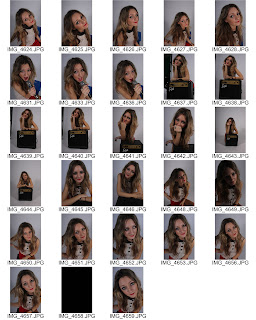
For the last few lessons I have been working on my article draft and finishing off my schedule. I have finished most of my article draft, I just need to make sure it is interesting and exciting enough for my target audience. Also, on Monday I did my magazine photo shoot which went extremely well. I did an indoor shoot and and outdoor shoot and both turned out great. I will need to do a contact sheet to display all my images that I took which I will do in the next few lessons. I also did a time lapse video for my indoor photo shoot which I have been putting together and adding music to, to make it more engaging. Also, when I did my outdoor photo shoot I got another media student to photograph me and my model, so I could display have a behind the scenes video on my blog.
Tuesday 15 November 2011
Diary Entry 7
Today I uploaded my masthead designs, edited my labels for my diary entries and completed my schedule. My schedule included what I have completed for my magazine so far, and what I need to do in the order I will do it. I also scanned my model release form onto my computer and uploaded it onto my blog. To upload my schedule, I had to put it on to scribd and make it a scribd document. In my schedule, I highlighted the tasks which I have completed in green to make it clear which tasks have been done, and which are yet to be completed. I edited my labels for my diary entries to make it simpler to access each entry. Now, all diary entries have the same label so it is easier to find them.


Monday 14 November 2011
Diary Entry 6
This week I have been finishing and improving my Magazine Proposal. To do this, I looked on the haydong321 hub blog so I knew exactly what needed to be included. Mainly, I added to content, business, synergy, target audience, competition to my magazine and why it will succeed. I found this task very helpful because I thought more about the specifics of my magazine and how I want it to look. I also randomly chose one of my name ideas ('BEAT')and started experimenting with fonts and colours for my masthead. I need to put my name idea fonts document onto my blog and will do so in my next lesson.
Monday 31 October 2011
Diary Entry 5
This week I have been focusing on my Audience Profile and my names ideas. For my audience profile task I used Prezi and I included the results from my survey which was on my blog. I gathered the results and explained what I thought of the results and how it helped me with my magazine. I also included what my ideal reader would be like and my target audience. This task definitely helped me make decisions about how I wanted my magazine to be presented and what I should include in it and how I should include these things.
I have also been working on my names ideas for my magazine. I have put my ideas on my blog and have also written my top 4 choices. I also wrote about why I chose these specific names and how I feel it will add to the success of my magazine.
During the next week I need to make decisions about my business feature in my Proposal and to make it more detailed.
Saturday 29 October 2011
Names Ideas
Here are the names I came up with for my music magazine. I have decided that my top choices are M.I.C, BASS, M and TONE.
My first choice is 'M.I.C' refers to a microphone which is always used in the music industry. I thought this masthead would be eye-catching and unique because of the use of full stops.
I also chose 'BASS' because it relates to my indie/rock genre and is a very straight-forward simple name which which immediately attract my target audience.
Another name I am considering is 'M'. Magazines such as 'Q' have a similar name which is simple but very effective and attractive. The 'M' would stand for music which instantly relates to my magazine. The masthead would be very clear and striking and it would be an easily recognisable name for audiences to remember.
I also chose 'TONE' because it relates to the way that music is represented in the indie/rock genre. I also chose it because the tone for my magazine is a very important element to me.
BASS
M
PITCH
TONE
M.I.C
AMP
CHORD
JAM
PLAY
PAUSE
SCREAM
MELODY
VOLUME
TONE
TUNETIME
Friday 28 October 2011
Tuesday 18 October 2011
Monday 17 October 2011
Diary Entry 1
Today I did my draft for my preliminary task. Our preliminary task is to create a school magazine front cover and contents page. MY target audience is year 7 and year 8 girls. I've been keeping this in mind when choosing my masthead 'The Haydon Times' and also when choosing my colour scheme. I chose that specific target audience because female students are more likely to buy a school magazine because they are generally more interested in their education. I chose the colour scheme blue, yellow and red because they are bright, eye-catching colours which will attract young girls.
I chose female models for my front cover image and my contents page image because females are my target audience. I made sure all of my colours and fonts stood out to appeal to the reader and then I started using Photoshop to put my magazine together. I had no difficulty using Photoshop but if I'd had more time, I would've use more text effects to make my magazine more interesting.


I chose female models for my front cover image and my contents page image because females are my target audience. I made sure all of my colours and fonts stood out to appeal to the reader and then I started using Photoshop to put my magazine together. I had no difficulty using Photoshop but if I'd had more time, I would've use more text effects to make my magazine more interesting.


Tuesday 4 October 2011
Monday 26 September 2011


Monday 19 September 2011
School Magazine


On the contents masthead, I used the filter effect 'Drop Shadow', to make the masthead more eye-catching and clear to the audience. On the contents page, I made the page numbers a different shade of blue to make the fonts more interesting and appealing to the audience.
I increased the size of my front cover image to grab the audiences' attention. I also chose to take images of girls because the target audience is girls.
I chose the masthead 'The Haydon Times' because it is quite sophisticated and serious and this appeals to my target audience because girls are more likely to buy a magazine that includes information about their education because they are generally more interested in their education than boys.
I also included lots of exclamation points to appeal to my target audience. These exclamation marks would make the magazine look more exciting and appealing to the reader.
To improve, next time I would add more effects to my tag-lines like drop-shadows and glow effects to make my magazine more interesting. If i had more time, I would also put an image of the Haydon stag on the contents page because this reminds the reader that this is a school magazine. I would also make the background colour of the contents page blue, to make the colour scheme more consistent. I also would make the plugs more interesting by having a different outline colour. Also, I would make the tagline on the contents page 'CHECK OUT YOUR BACK TO SCHOOL EDITION!' more bold and maybe change the font to make it more interesting and appealing.


Subscribe to:
Posts (Atom)